
The sd() function in R calculates the sample standard deviation of a numeric vector or an object, excluding factors. It uses Bessel’s correction (n-1).

The standard deviation is a measure that tells you how spread out the data is in a dataset. It is a measurement of the dispersion of the values.
If the standard deviation is higher, then the spread of values is wider.
If the standard deviation is lower, then the spread of values is narrower.
It shows the central tendency, which is helpful in any data analysis.
SD is the square root of variance.
Here is the mathematical formula:
sd = sqrt(sum((x - mean(x))^2) / (n - 1))
Syntax
sd(x, na.rm = FALSE)Parameters
| Name | Description |
| x | It is a numeric vector or any R object except factors. |
| na.rm | It stands for where to remove NA values. It is logical, so it can have two values:
If FALSE, NA values will be included in the calculation. If TRUE, NA values won’t be included in the calculation. |
Standard deviation of a numeric vector
Let’s define a simple numeric vector and find its standard deviation.
# Create a numeric vector using c() function
vec <- c(11, 21, 19, 46, 50)

# Find the standard deviation of the vector using sd() function
stddev <- sd(vec)

# Print the standard deviation using the print() function
print(stddev)

# Output: [1] 17.4442
Numeric vector with identical values
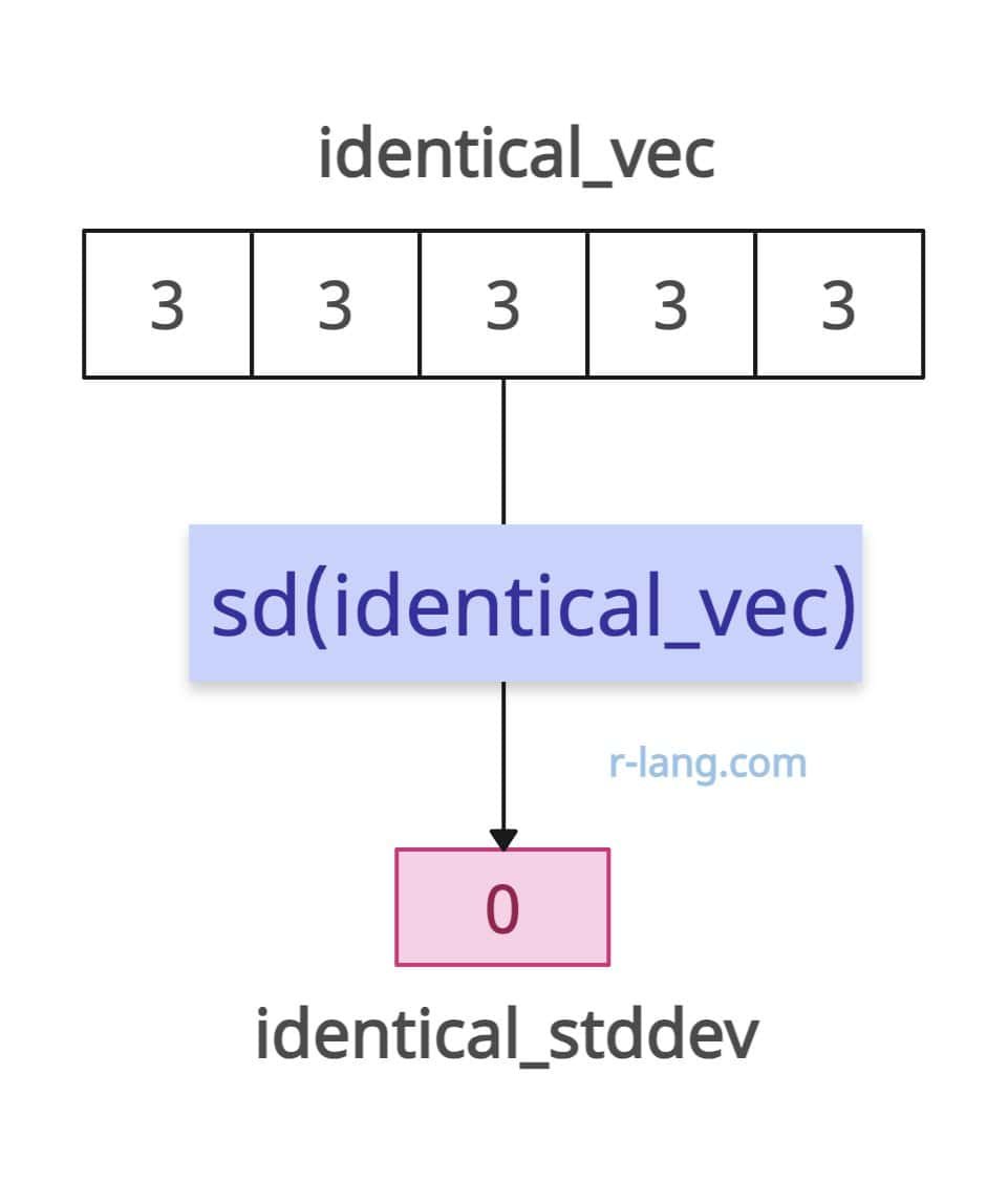
What if your input vector has identical values? Does it make sense to calculate its standard deviation? Yes, it does, and it tells you there’s no variability in the dataset, since the values are the same.
So, the standard deviation is 0.
identical_vec <- c(3, 3, 3, 3, 3)

identical_stddev <- sd(identical_vec)

print(identical_stddev)

# Output: [1] 0
Empty vector
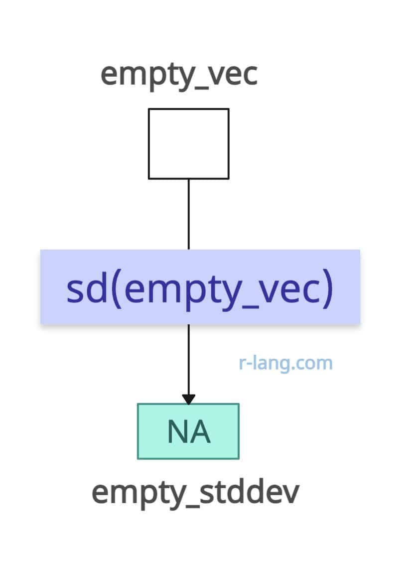
If the input is empty, the output will be NA.
empty_vec <- c()

empty_stddev <- sd(empty_vec)

print(empty_stddev)

# Output: [1] NA
Array

rv <- c(19, 21)
rv2 <- c(46, 4)

arr <- array(c(rv, rv2), dim = c(2, 2, 2))

sd(arr)

# Output: [1] 16.11565
Matrix

mat <- matrix(1:9, ncol = 3)

sd(mat)

# Output: [1] 2.738613
To calculate the standard deviation of each column, you need to use the “apply()” function in combination with the sd() function.

In the above figure, we calculated the standard deviation of each matrix column.
mat <- matrix(1:9, ncol = 3)

apply(mat, 2, sd)

# Output: [1] 1 1 1
Handling NA values
Pass the na.rm = TRUE argument within the sd() function to handle NA values in the data frame. This argument tells R to remove NA values before performing the calculation.
df <- data.frame(
 col1 = c(1, NA, 3),
 col2 = c(NA, 5, 6),
 col3 = c(7, 8, NA)
)

sds <- apply(df, 2, sd, na.rm = TRUE)

sds

# Output
#  col1       col2       col3
# 1.4142136  0.7071068   0.7071068
All NA values
If the input vector only contains NA values, the standard deviation will be NA too.
na_vec <- c(NA, NA, NA)

na_stddev <- sd(na_vec, na.rm = TRUE)

print(na_stddev)

# Output: [1] NA
Infinite values
While calculating SD, if it encounters an Inf (infinity) value, the output will be NaN (Not A Number).
inf_vec <- c(11, 21, Inf, 14, 5)

inf_stddev <- sd(inf_vec)

print(inf_stddev)

# Output: [1] NaN
Using Real Dataset with Visualization
Use the read_csv() method to import the real-world dataset.
For this tutorial, we will use Kaggle’s StudentPerformance.csv file as a dataset and find the standard deviation of the “math score” column.
Step 1: Install the required libraries
You need to install tidyverse and ggplot2 libraries if you have not already!
install.packages("tidyverse")

install.packages("ggplot2")
Step 2: Load the dataset
library(tidyverse)
library(ggplot2)

data <- read_csv("./DataSets/StudentsPerformance.csv")

head(data)
Step 3: Finding Standard Deviation
Let’s focus on the “math score” column for understanding standard deviation.
# Using built-in R function for verification
std_dev <- sd(data$`math score`)

print(std_dev)

# Output: [1] 15.16308
Step 4: Visualization
We will create a histogram to visualize the distribution of math scores.
On top of this histogram, we will overlay vertical lines to represent the mean and the standard deviations.
# Plot histogram
p <- ggplot(data, aes(x = `math score`))
+ geom_histogram(aes(y = ..density..),
  binwidth = 5,
  fill = "blue", alpha = 0.7
)
+ geom_density(alpha = 0.2, color = "red") + # Adding a density plot
  # Add vertical line for mean
  geom_vline(aes(xintercept = mean_math),
  color = "green", linetype = "dashed", size = 1
 ) +

  # Add vertical lines for standard deviations
  geom_vline(aes(xintercept = (mean_math - std_dev_math_builtin)),
  color = "purple", linetype = "dotted", size = 0.8
 ) +
  geom_vline(aes(xintercept = (mean_math + std_dev_math_builtin)),
  color = "purple", linetype = "dotted", size = 0.8
 ) +
  geom_vline(aes(xintercept = (mean_math - 2 * std_dev_math_builtin)),
  color = "orange", linetype = "dotted", size = 0.8
 ) +
  geom_vline(aes(xintercept = (mean_math + 2 * std_dev_math_builtin)),
  color = "orange", linetype = "dotted", size = 0.8
 ) +
  geom_vline(aes(xintercept = (mean_math - 3 * std_dev_math_builtin)),
  color = "yellow", linetype = "dotted", size = 0.8
 ) +
  geom_vline(aes(xintercept = (mean_math + 3 * std_dev_math_builtin)),
  color = "yellow", linetype = "dotted", size = 0.8
 ) +

 # Add labels and title
  labs(
   title = "Distribution of Math Scores with Mean & Standard Deviations",
    x = "Math Score", y = "Density"
  ) +
  theme_minimal()

# Display the plot
p
Output

The green dashed line represents the mean.
The purple, orange, and yellow dotted lines represent 1, 2, and 3 standard deviations away from the mean, respectively.

Krunal Lathiya is a seasoned Computer Science expert with over eight years in the tech industry. He boasts deep knowledge in Data Science and Machine Learning. Versed in Python, JavaScript, PHP, R, and Golang. Skilled in frameworks like Angular and React and platforms such as Node.js. His expertise spans both front-end and back-end development. His proficiency in the Python language stands as a testament to his versatility and commitment to the craft.