Mean means the arithmetic average of a number in mathematics. An average is the sum of total numbers divided by the count of the numbers.
To calculate the arithmetic mean of a vector or dataset in R, use the mean() function.
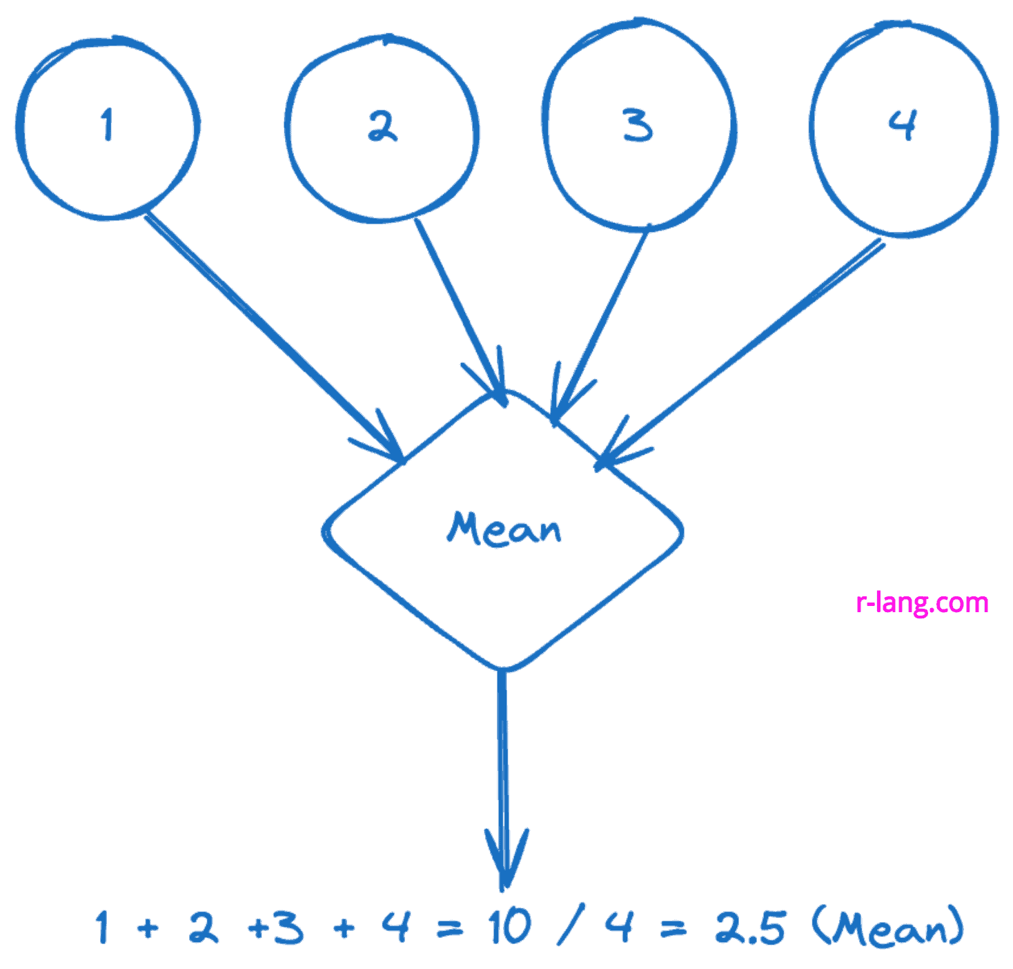
The above figure shows the simplest example of the mean, which returns 2.5.
mean(x, na.rm)| Name | Description |
| x | It is a numeric vector or dataset |
| na.rm | If you set this argument to TRUE, it will ignore NA values; otherwise, it will be included in the calculation, which results in NA in the output. |
In the above figure, we calculated the mean of the vector containing seven elements.
vec <- c(11, 21, 19, 18, 51, 51, 71)

# Calculating average using mean()
mean(vec)
Output
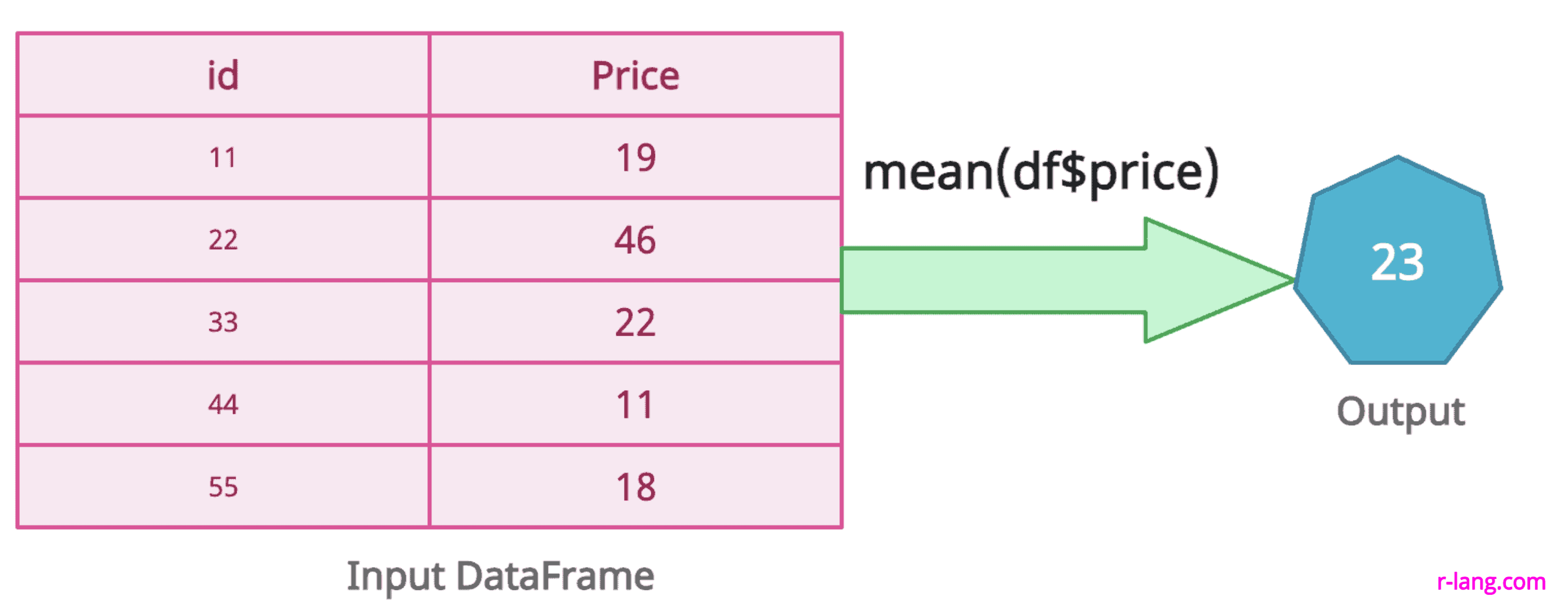
[1] 34.57143The above figure returns the mean of DataFrame’s price column.
df <- data.frame(
  id = c(11, 22, 33, 44, 55),
  price = c(19, 46, 21, 11, 18)
)

# Calculate mean of DataFrame column
mean_of_col <- mean(df$price)
mean_of_col
Output
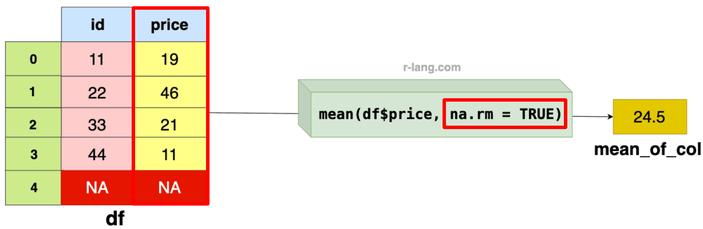
[1] 23If your data frame contains NA values, it does not exclude them by default and returns NA as an output.
This is a default principle of missing or unknown values that makes the mean undefined or not meaningful.
df <- data.frame(
  id = c(11, 22, 33, 44, NA),
  price = c(19, 46, 21, 11, NA)
)

# Calculate mean of DataFrame column
mean_of_col <- mean(df$price)
mean_of_col
Output
[1] NAIn the above figure, we passed the na.rm = TRUE to the mean() function to skip the NA value while calculating the mean of the remaining column values.
df <- data.frame(
  id = c(1, 2, 3, 4, NA),
  price = c(11, 22, 33, 44, NA)
)

# Calculate mean of DataFrame column
mean_of_col <- mean(df$price, na.rm = TRUE)
mean_of_col
Output
[1] 24.5
In the above code example, we calculated the mean value of the price column’s (11, 22, 33, 44) values.
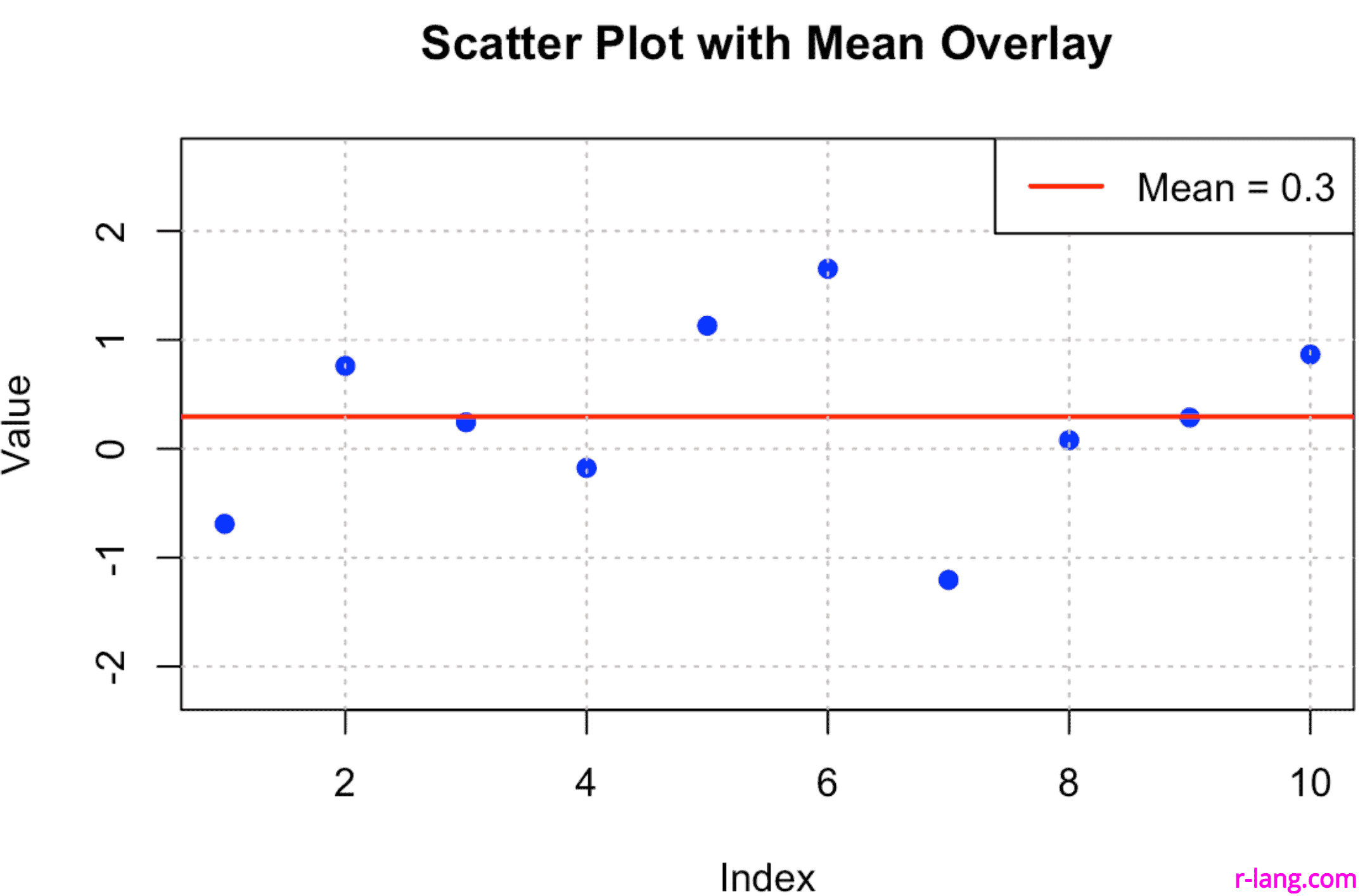
# Generating 10 random numbers from a standard normal distribution
data <- rnorm(10)

# Calculate the mean
data_mean <- mean(data)

# Plotting the data using base R graphics
plot(1:10, data, pch=19, col="blue", ylim=c(min(data) - 1, max(data) + 1),
     xlab="Index", ylab="Value", main="Scatter Plot with Mean Overlay")
abline(h=data_mean, col="red", lwd=2) # Overlaying the mean
grid(col="gray")
legend("topright", legend=paste("Mean =", round(data_mean, 2)), col="red", lwd=2)
Output
The above data visualization plot shows how to plot data points but also how to enhance a plot with additional elements like mean lines, legends, and grid lines for better readability and interpretation.
Krunal Lathiya is a seasoned Computer Science expert with over eight years in the tech industry. He boasts deep knowledge in Data Science and Machine Learning. Versed in Python, JavaScript, PHP, R, and Golang. Skilled in frameworks like Angular and React and platforms such as Node.js. His expertise spans both front-end and back-end development. His proficiency in the Python language stands as a testament to his versatility and commitment to the craft.
Picture this: You are playing Snakes and Ladder and need the dice to roll the…
The copy-on-modify semantics is a memory management technique that modifies one or more objects, copies…
The standard deviation is a measure that tells you how spread out data are in…
List in R is a data structure that can hold multiple types of elements. You…
The ln() function from the SciViews package calculates the natural log of the input vector.…
To convert a list to a numeric value in R, you can combine the unlist()…